What is Masonry Layout?
Masonry layout, also known as Waterfall layout, is a popular way to display images of different sizes together nowaday. Even though this kind of layout has been out quite some time, the popularity arises when Pinterest uses it as its main layout and becomes popular.
A common approach to show multiple images together would be to give each image equal width or equal height, and let the other side of the image grow according to its original ratio. However, if images were not resize to equal width and height ahead of time, it’s very likely that your users will upload images of different sizes, and your layout will now look a mess.
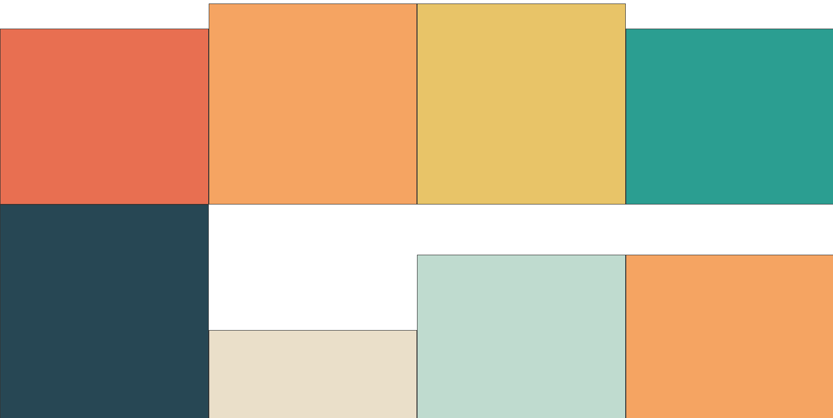
Masonry layout on the other hand, will remove the unnecessary white spaces between images. So that not only you can utilize your page more efficiently, the look and feel of your page will now look more consistent.
Benefits of Masonry Layout
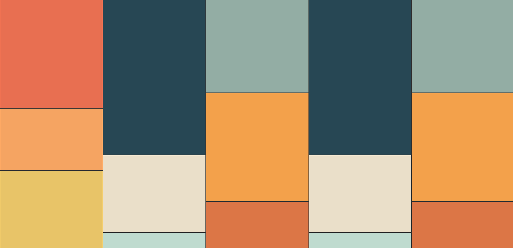
Besides from keeping your page layout consistent, one major benefit that Masonry layout will bring to you is that it will make your users want to keep reading. As long as there are enough contents, there will always be contents that are only partially shown to the users, which will in the end create this endless reading effect.
Implementation
Masonry layout will work on any HTML layout that has a parent element containing multiple child elements. A most common example will be an unordered list:
<ul class="container">
  <li class="card --red"></li>
  <li class="card --orange"></li>
  <li class="card --yellow"></li>
  <li class="card --green"></li>
  <li class="card --dark"></li>
  <li class="card --white"></li>
  <li class="card --gray"></li>
  <li class="card --orange"></li>
  <li class="card --dark-gray"></li>
  <li class="card --skin"></li>
  <li class="card --brown"></li>
  <li class="card --green"></li>
  <li class="card --dark"></li>
  <li class="card --white"></li>
  <li class="card --gray"></li>
  <li class="card --yellow"></li>
  <li class="card --dark-gray"></li>
  <li class="card --skin"></li>
  <li class="card --brown"></li>
  <li class="card --red"></li>
</ul>
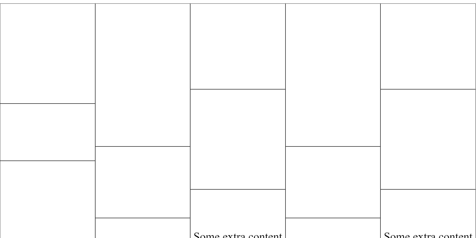
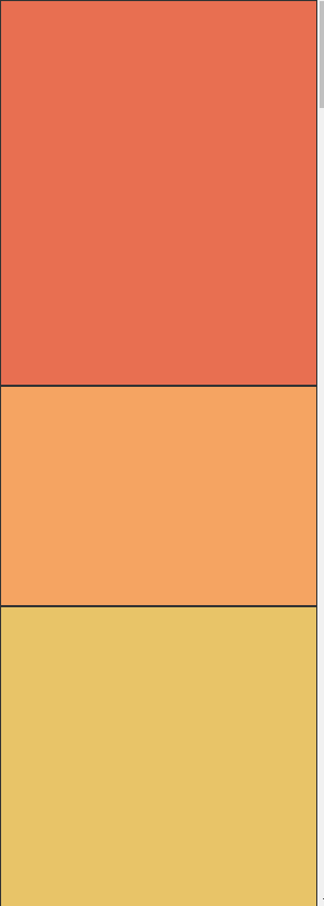
In the code above, we give the unordered list element a class called container and each list element within a class called card. Since we are not using actual images here, we give each element a color class and specify each color with different height to demonstrate the scenario when you have images of different sizes.
To make the Masonry layout happen, we only need to apply a CSS property called column-count: n to the parent element.
Column count, following by number of columns, allows you to specify how many columns you’d like to split your page into. When you add this property to the parent element, the children element within will automatically resize its width, so that the number of elements per row will match your column count specification.
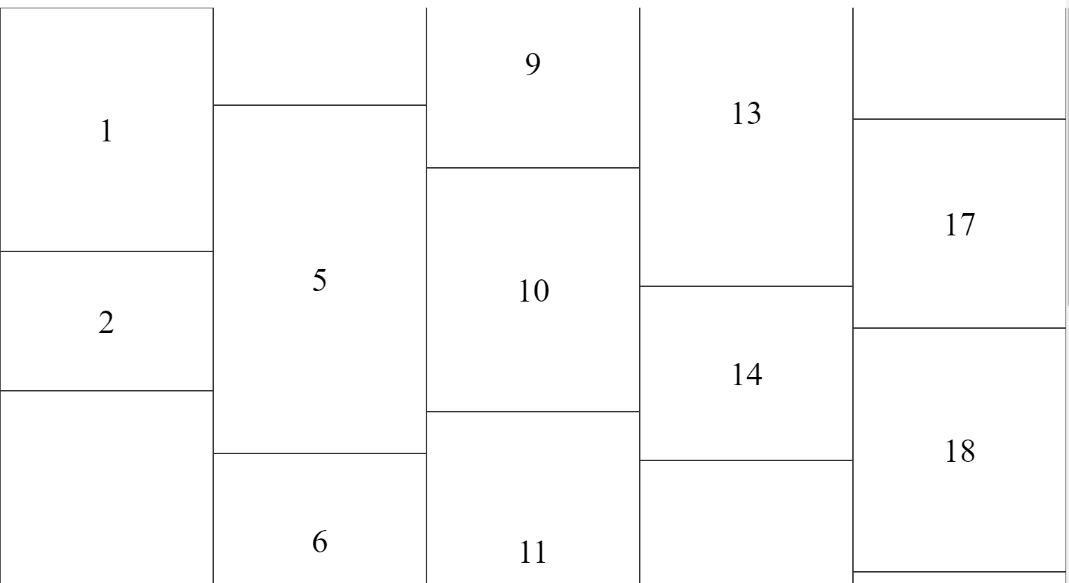
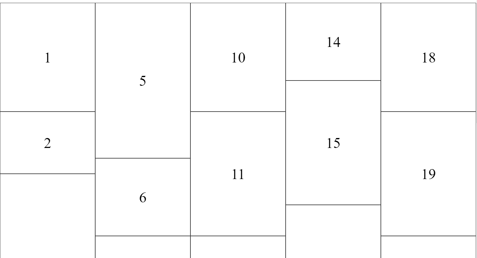
It is important to note the direction of the column is vertical instead of horizontal as demonstrated in the figure above. Also notice how some items are broken into multiple columns. To avoid this behavior, we need to add the break-inside: avoid to each child element.
.container {
  list-style: none;
  column-gap: 0;
  padding: 0;
  column-count: 5;
}
.card {
  width: 100%;
  height: 400px;
  padding: 0;
  margin: 0;
  box-sizing: border-box;
  border: 1px solid #333;
  break-inside: avoid;
}
You may also use the column-gap property to add some spaces between each column.
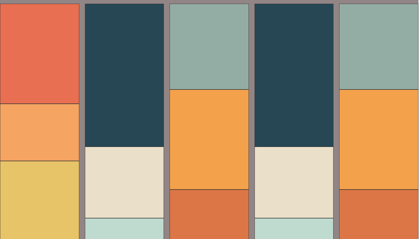
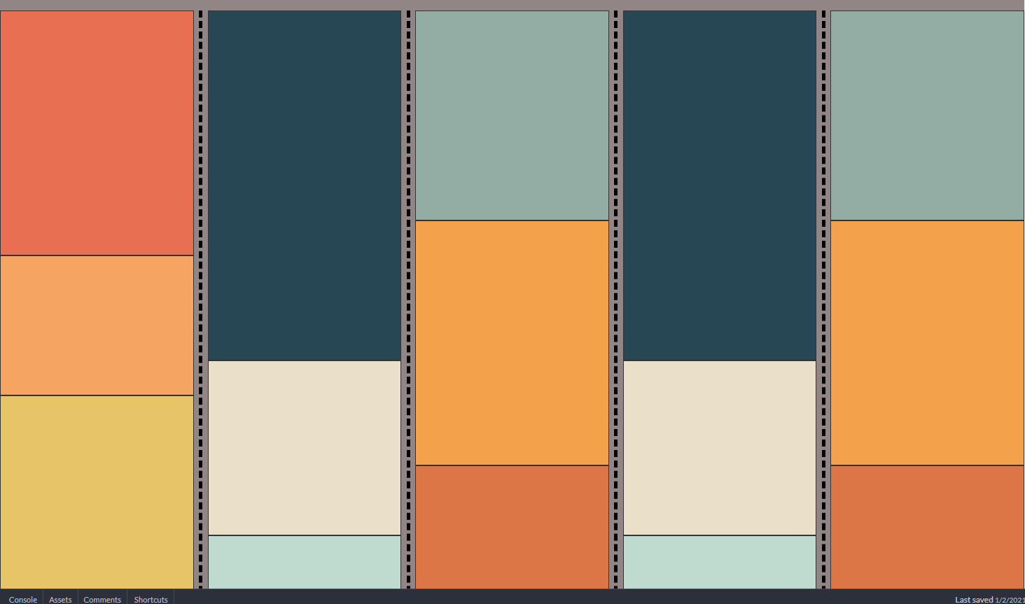
If you would like to add some sort of line breaker between each column, use the column-rule property.
RWD Support
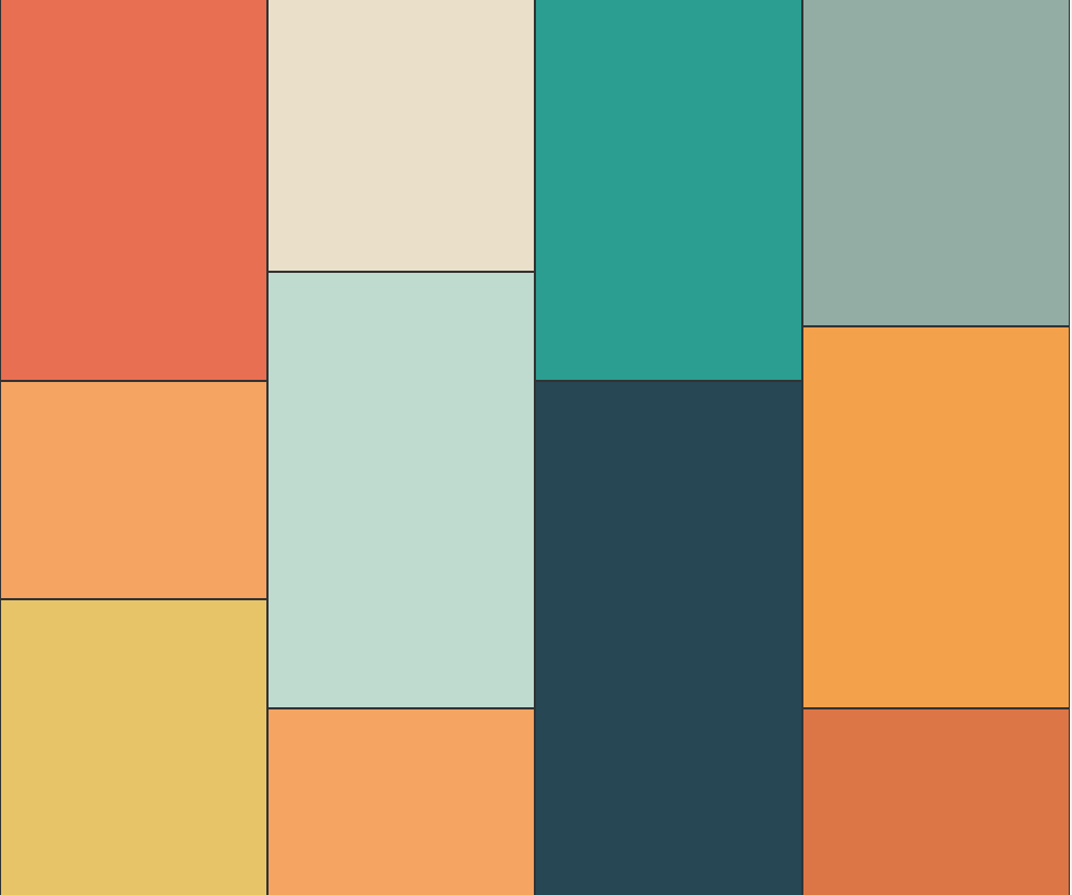
To make the layout fully compatible with all devices, we just need to change the column-count to a bigger number when we’re on big devices, or to a smaller number when we are on small devices.


Browser Support

The column-count property has very good browser support. Almost all browsers will work with this property.
CodePen of this article can be found at:
