Introduction
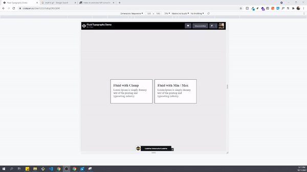
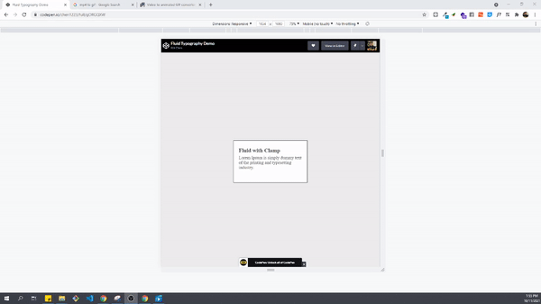
The idea of Fluid Typography has been around for quite some time. It is about scaling the font-size up or down depending on the screen size. In the past we used media queries to set breakpoints and adjust font-size for each different device. While this approach still works, it’s quite time consuming and hard to maintain. Now with the release of the new clamp property, we can achieve the same result with just one line of CSS without setting complex media queries.
The Clamp Property
The clamp takes in three arguments in the following syntax:
font-size: clamp(min value, prefer value, max value);min value: The minimum font-size
prefer value: The prefer font-size. Usually set in relative units. (i.e. rem, em, vw, etc…)
max value: The maximum font-size
As the screen size changes, browsers will try to apply the prefered font-size value, but if the preferred value has passed the min/max threshold, browsers will apply min/max font-size instead.
Beyond Font Size
It is worth mentioning that the clamp property can also be used for setting min/max margin or padding. The syntax is identical, we simply specify the min/max and preferred value for margin/padding.
For instance if we want to set a dynamic vertical margin we can use the following syntax:
margin: clamp(0.5rem, 0.75vw, 1rem) 0;Browser Support and Fallback
The clamp property has a good range of browser support. It can be used on all major browsers.
However, since it’s a relatively new CSS property, it doesn’t work on IE unfortunately.
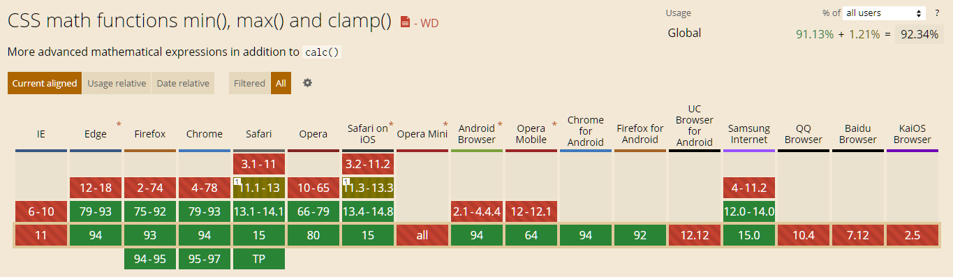
On browsers that do not support the clamp property, you can use min(), max() property to achieve the same result.
font-size: max( min value, min( prefer value, max value ) );