
Introduction
As 2020 comes to an end, new UI trends for 2021 starts to appear and one of the coolest trends for 2021 is the Glassmorphism. Glassmorphism allows you to create HTML elements that look like frosted glass and have a blurry transparent effect. In this tutorial we will walk you through the process of creating a glassmorphism credit card using only CSS.
The final output will look like below

Colorful Background
Let us start by creating the orange background. When you use glassmorphism in your design, you must place it before a colorful background or have an image in order to contrast with the glassmorphism element.
HTML
<div class="bg"></div>CSS
.bg {
  background-color: #d39d65;
  height: 100vh;
  width: 100vw;
  display: flex;
  justify-content: center;
  align-items: center;
  position: relative;
  z-index: -5;
}
The CSS for the bg class is very simple. We set an orange color as background and center everything within at the middle using flex-box;
Credit Card Container
For the credit card container, we will create a div element inside the bg div element with a class called “credit-card”. Later all elements on the credit card will live inside the container.
HTML
<div class=”bg”>
  <div class=”credit-card”></div>
</div>
CSS
.credit-card {
  width: 500px;
  height: 300px;
  background: rgba(255,255,255,0.2);
  border-radius: 10px;
  background-clip: padding-box;
  backdrop-filter: blur(20px);
  border: 2px solid transparent;
  box-shadow: 1px 1px 1px rgba(218, 128, 36, 0.03);
  z-index: 1;
  position: relative;
  box-sizing: border-box;
  padding: 1.5em;
}
The key css properties that makes the element has glassmorphism effect are the following two properties:
background-filter: blur(20px)
With this property you can specify how blurry you want to make the element. The higher the pixel, the more blurry it will be. In contrast, blur(0) will have no blur effect at all.
background-clip: padding-box
This property defies how far the background (color or image) should extend within an element. After adding this property and some padding to our credit-card element, we can keep the blurry area at the center of the credit-card element while keeping all edges clear and without any blurry effect.

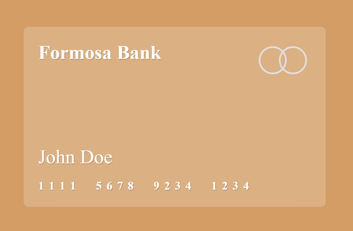
Pay attention to how the edges are cut off beautifully. This is achieved by the background-clip property.
Add Remaining Credit Card Elements
HTML
<div class="bg">
  <!-- Credit Card -->
  <div class="credit-card">
    <!-- Bank title -->
    <div class="brand">
      <span class="bank">Formosa Bank</span>
    </div><!-- End of bank title -->
    <!-- Logo container -->
    <div class="logo-container">
      <figure class="logo"></figure>
    </div><!-- End of logo container -->
    <!-- Card holder -->
    <span class="card-holder">John Doe</span><!-- End of card holder -->
    <!-- Number container -->
    <div class="number-container">
      <span class="number">1</span>
      <span class="number">1</span>
      <span class="number">1</span>
      <span class="number">1</span>
      <span class="number">5</span>
      <span class="number">6</span>
      <span class="number">7</span>
      <span class="number">8</span>
      <span class="number">9</span>
      <span class="number">2</span>
      <span class="number">3</span>
      <span class="number">4</span>
      <span class="number">1</span>
      <span class="number">2</span>
      <span class="number">3</span>
      <span class="number">4</span>
    </div><!-- End of number container -->
  </div><!-- End of Credit Card -->
</div>
CSS
.bank {
  font-weight: bold;
  font-size: 2em;
  color: white;
  text-shadow: 1px 1px rgba(0,0,0,0.2);
}
.logo-container {
  position: absolute;
  top: 1em;
  right: 1.5em;
}
.logo {
  width: 40px;
  height: 40px;
  border: 3px solid #dfdfdf;
  background: none;
  border-radius: 50%;
  position: relative;
  &:after {
    content: '';
    position: absolute;
    right: -90%;
    top: -3px;
    width: 100%;
    height: 100%;
    border-radius: 50%;
    border: 3px solid #dfdfdf;
  }
}
.card-holder {
  color: #fefefe;
  text-shadow: 1px 1px rgba(0,0,0,0.2);
  font-size: 2rem;
  position: absolute;
  bottom: 2em;
}
.number-container {
  position: absolute;
  bottom: 1.5em;
  left: 1.5em;
  .number {
    font-size: 1.2em;
    margin-right: .2em;
    font-weight: bold;
    color: white;
    text-shadow: 1px 1px rgba(0,0,0,0.2);
    &:nth-child(4n+4) {
      margin-right: 1.5em;
    }
  }
}
In order to simulate 3D texts on credit cards, we added text-shadow to all our text elements.
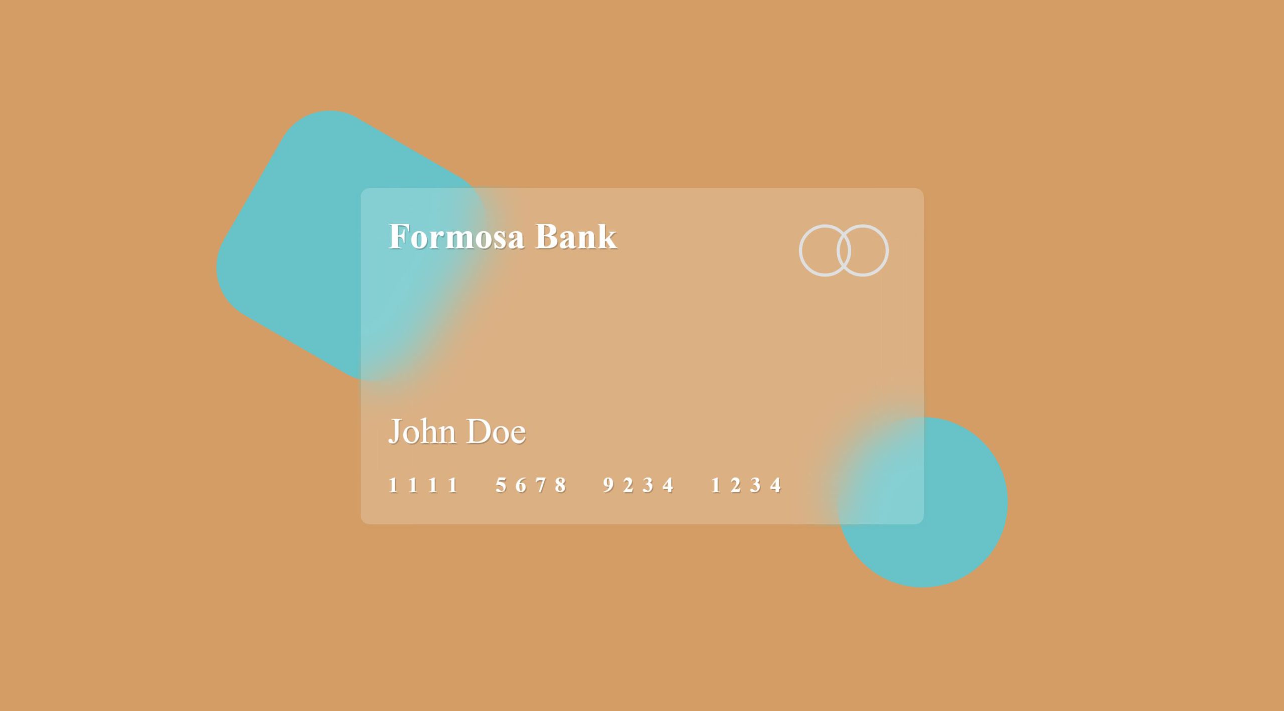
Finishing touches
To really make the glassmorphism effect stand out, let us place some decorations at the border of the credit card to demonstrate the effect. We will add the following two new elements to the HTML below the credit-card div element. And to make them always be at the edge of the credit card, we’ll add a parent div that wrap credit card and these new decorators.
HTML
<div class="container">
  <div class="credit-card">...</div>
  <figure class="circle"></figure>
  <figure class="rect"></figure>
</div>
CSS
.container {
  position: relative;
}
.circle {
  position: absolute;
  width: 150px;
  height: 150px;
  border-radius: 50%;
  background: #4dcde2;
  z-index: -1;
  right: 18%;
  bottom: 15%;
  opacity: .8;
}
.rect {
  background: #4dcde2;
  width: 200px;
  height: 200px;
  border-radius: 3em;
  position: absolute;
  z-index: -1;
  left: 15%;
  top: 16%;
  transform: rotate(30deg);
  opacity: .8;
}
End Result
Complete listing
HTML
<div class="bg">
  <!-- Container -->
  <div class="container">
    <!-- Credit Card -->
    <div class="credit-card">
      <!-- Bank title -->
      <div class="brand">
       <span class="bank">Formosa Bank</span>
     </div><!-- End of bank title -->
      <!-- Logo container -->
      <div class="logo-container">
        <figure class="logo"></figure>
      </div><!-- End of logo container -->
      <!-- Card holder -->
      <span class="card-holder">John Doe</span><!-- End of card holder -->
      <!-- Number container -->
      <div class="number-container">
      <span class="number">1</span>
      <span class="number">1</span>
      <span class="number">1</span>
      <span class="number">1</span>
      <span class="number">5</span>
      <span class="number">6</span>
      <span class="number">7</span>
      <span class="number">8</span>
      <span class="number">9</span>
      <span class="number">2</span>
      <span class="number">3</span>
      <span class="number">4</span>
      <span class="number">1</span>
      <span class="number">2</span>
      <span class="number">3</span>
      <span class="number">4</span>
    </div><!-- End of number container -->
    </div><!-- End of Credit Card -->
    <figure class="circle"></figure>
    <figure class="rect"></figure>
  </div><!-- End of container -->
</div>
CSS
body {
  margin: 0;
  padding: 0;
}
.bg {
  background-color: #d39d65;
  height: 100vh;
  width: 100vw;
  display: flex;
  justify-content: center;
  align-items: center;
  position: relative;
  z-index: -5;
}
.container {
  position: relative;
}
.credit-card {
  width: 500px;
  height: 300px;
  background: rgba(255,255,255,0.2);
  border-radius: 10px;
  background-clip: padding-box;
  backdrop-filter: blur(20px);
  border: 2px solid transparent;
  box-shadow: 1px 1px 1px rgba(218, 128, 36, 0.03);
  z-index: 1;
  position: relative;
  box-sizing: border-box;
  padding: 1.5em;
}
.bank {
  font-weight: bold;
  font-size: 2em;
  color: white;
  text-shadow: 1px 1px rgba(0,0,0,0.2);
}
.logo-container {
  position: absolute;
  top: 1em;
  right: 1.5em;
}
.logo {
  width: 40px;
  height: 40px;
  border: 3px solid #dfdfdf;
  background: none;
  border-radius: 50%;
  position: relative;
  &:after {
    content: '';
    position: absolute;
    right: -90%;
    top: -3px;
    width: 100%;
    height: 100%;
    border-radius: 50%;
    border: 3px solid #dfdfdf;
  }
}
.card-holder {
  color: #fefefe;
  text-shadow: 1px 1px rgba(0,0,0,0.2);
  font-size: 2rem;
  position: absolute;
  bottom: 2em;
}
.number-container {
  position: absolute;
  bottom: 1.5em;
  left: 1.5em;
  .number {
    font-size: 1.2em;
    margin-right: .2em;
    font-weight: bold;
    color: white;
    text-shadow: 1px 1px rgba(0,0,0,0.2);
    &:nth-child(4n+4) {
      margin-right: 1.5em;
    }
  }
}
.circle {
  position: absolute;
  width: 150px;
  height: 150px;
  border-radius: 50%;
  background: #4dcde2;
  z-index: -1;
  right: -20%;
  bottom: -25%;
  opacity: .8;
}
.rect {
  background: #4dcde2;
  width: 200px;
  height: 200px;
  border-radius: 3em;
  position: absolute;
  z-index: -1;
  left: -35%;
  top: -25%;
  transform: rotate(30deg);
  opacity: .8;
}
You can find the demo of this tutorial on CodePen: