Introduction
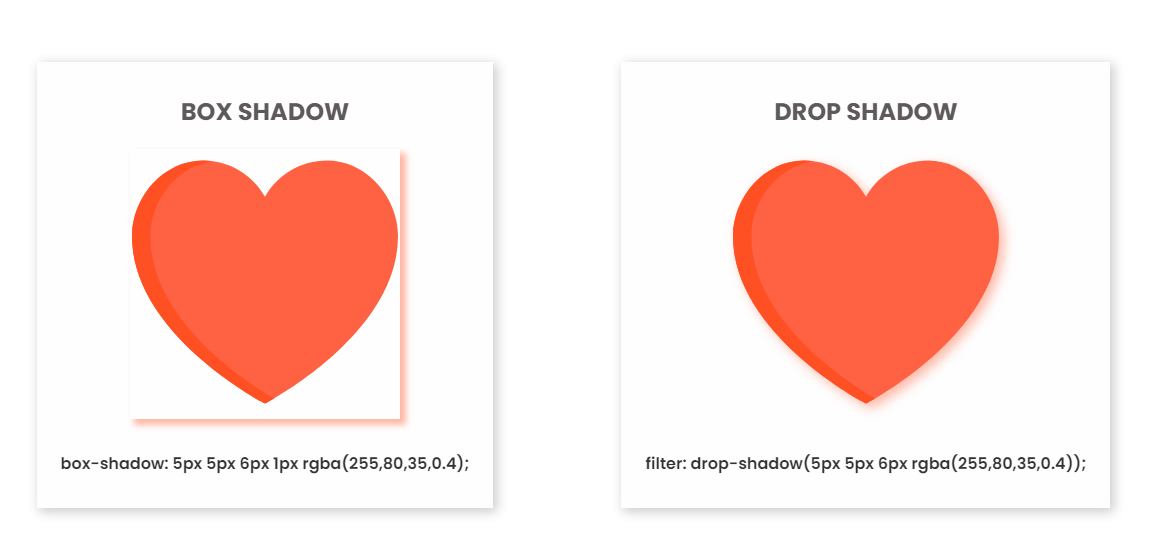
If you have been working with CSS for a while, then you might have encountered scenarios where you need to apply shadow on HTML elements to make them look realistic. In CSS, our first instinct to add shadow would be to use the box-shadow property. Box-shadow takes in 5 properties as its parameters: x offset, y offset, blur, spread, and color. Even though it can fulfill most of our use cases, in situations where the element we want to apply shadow to has an irregular shape (image or svg for example), the end result will look funky and have some unwanted white space.

This is obviously not the desired behaviour. What can we do to solve this issue, so that the shadow will stay at the border of the image and not at the container?
Drop-Shadow to the Rescue
In fact, there is one other CSS property that can be used exactly for situations like this – drop-shadow property. Drop-shadow belongs to the CSS filter function. It takes in 4 properties, x offset, y offset, blur, and color; Even though it does not have the spread property like box-shadow does, it is capable of creating a shadow that conforms to the element itself.

Doesn’t it look much closer to what we were aiming for?
It’s also worth mentioning that drop-shadow not only works for images, but can also be used for grouped elements. For instance if you have two child div elements inside a parent div, you can also apply drop-shadow directly on the parent div. The shadow will wrap around both child div elements together and looks more realistic.
Browser Support

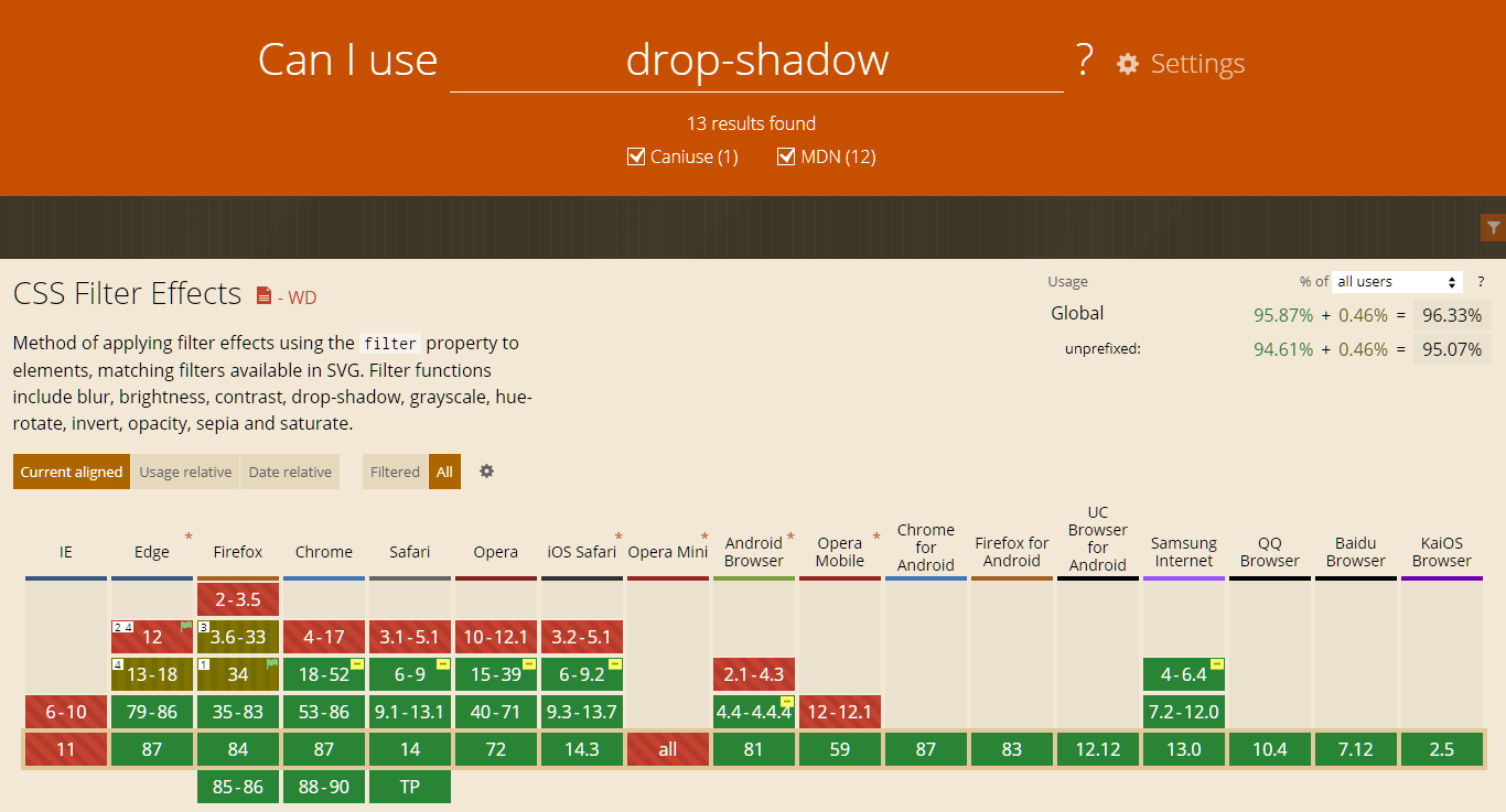
According to caniuse.com the drop-shadow property works on majority modern browsers except Internet Explorer, but Microsoft is asking IE users to switch to their new browser Edge too, so this shouldn’t be a problem.
End Result

You can find the demo of this article at
