Introduction
As dark mode becomes one of the major trends in 2020, more and more people start to integrate dark mode into their new projects due to its high accessibility and the low to zero pressure it brings to audiences’ eyes. In this tutorial, I will walk you through the complete process of creating a light / dark mode toggle using only plain Javascript and CSS. We will be looking at a small card example, but the concept is the same and can be easily adjusted to suit your own business case.
Getting the HTML ready
For the HTML, besides from container div elements, we only need to care about the toggler element and the card element.
<!-- Container -->
<div class="container">
  <div class="inner-wrapper">
    <!-- Controller Row -->
    <div class="controller-row">
      <label class="switch">
        <input id="toggler" type="checkbox">
        <span class="slider round"></span>
      </label>
    </div><!-- End of controller row -->
    <!-- Card -->
    <div class="card">
      <div class="card__header">
        <h2 class="__title">Card Title</h2>
      </div>
      <div class="card__body">
        <p class="__detail">
          Lorem Ipsum is simply dummy text of the printing and typesetting industry. Lorem Ipsum has been the industry's standard dummy text ever since the 1500s, when an unknown printer took a galley of type and scrambled it to make a type specimen book.
        </p>
      </div>
    </div><!-- End of card -->
  </div>
</div><!-- End of container-->
Some CSS class to note before we continue:
- container: Div element that wraps around all elements. Will be our main background.
- card: The parent div element of our entire card. It is also where the box-shadow will live.
- __title: Card title
- __detail: Body text of the card
Main elements on the HTML:
Container
In this tutorial, we use a div element with the CSS class container to be our page background, but in real projects, this could be the body element or your parent element.
Toggler
The toggler element is taken directly from W3School since it’s not the main focus of this tutorial, but you may replace it with your own switch.
Card
The card contains three elements: title, body text and shadow. We will change these elements’ appearance in light mode and dark mode.
Prepare CSS variables
In order to easily switch appearance between light mode and dark mode, we need to create some CSS variables. We will later uee colors defined by these variables directly on our HTML elements. By doing so, we can override these variables when we are in dark mode instead of rewriting an entire CSS set for dark mode.
/*** Light Mode Theme ***/
:root, [data-theme="default"] {
  --body-bg-color: #fff;
  --card-bg-color: #fff;
  --box-shadow-color: rgba(0,0,0,0.2);
  --text-color: #333;
  --switch-on-color: #444352;
  --switch-off-color: #ccc;
  --toggler-color: #fff;
}
/* Dark Mode Theme */
[data-theme="dark"] {
  --body-bg-color: #444352;
  --card-bg-color: #545363;
  --box-shadow-color: rgb(18, 18, 19, 0.2);
  --text-color: #efefef;
  --toggler-color: #444352;
  --switch-on-color: #fff;
  --switch-off-color: #ccc;
}
In the CSS code above, we first create CSS variables that target the root element and the default theme. (Light Mode) Then we override these variables and give them different values inside the dark mode selector. Light mode and Dark mode are defined by using the HTML attribute: data-theme of course you may name this attribute to any value you want.
Note.
It’s recommended to use the native CSS var() function over the $ sign in SCSS because with CSS variables, when you override the variables’ properties, they will directly be applied to the HTML elements that reference them. On the other hand, with SCSS $ sign, you will need to reassign the variables to the elements you want.
Bind CSS variables to HTML
* {
  font-family: 'Poppins', sans-serif;
  // Bind text color to the '--text-color' variable
  color: var(--text-color);
  transition: color .45s ease-in;
}
.container {
  height: 100vh;
  width: 100vw;
  display: flex;
  // Bind page background color to the '--body-bg-color' variable
  background-color: var(--body-bg-color);
  transition: background-color .45s ease-in;
}
.card {
  margin: auto;
  width: 300px;
  padding: 10px 15px;
  box-shadow: 2px 3px 4px 1px var(--box-shadow-color);
  // Bind box shadow color to the '--box-shadow-color' variable
  box-shadow-color: var(--box-shadow-color);
  background-color: var(--card-bg-color);
  transition: background-color .45s ease-in,
              box-shadow-color .45s ease-in;
}
.slider {
  position: absolute;
  cursor: pointer;
  top: 0;
  left: 0;
  right: 0;
  bottom: 0;
  // Bind the toggle background color (unchecked) to the '--switch-off-color' variable
  background-color: var(--switch-off-color);
  -webkit-transition: .4s;
  transition: .4s;
}
.slider:before {
  position: absolute;
  content: "";
  height: 12px;
  width: 12px;
  left: 4px;
  bottom: 4px;
  // Bind the toggle inner circle color to the '--toggler-color' variable
  background-color: var(--toggler-color);
  -webkit-transition: .4s;
  transition: .4s;
}
input:checked + .slider {
  // Bind the toggle background color (checked) to the '--switch-on-color' variable
  background-color: var(--switch-on-color);
}
input:focus + .slider {
  // Bind the toggle box shadow color to the '--switch-on-color' variable
  box-shadow: 0 0 1px var(--switch-on-color);
}
Important thing to point out during variable binding is that if you wish to add smooth transitions or animations to your element, make sure you use background-color instead of background.
Javascript logics
The Javascript part is relatively simple. We want to set or remove the data-theme attribute to the container div element when users toggle the switch. We can achieve this by adding an event listener to the switch toggle.
// On toggler clicked
var container = document.getElementsByClassName('container')[0];
document.getElementById('toggler').addEventListener('change', (event) => {
  console.log(toggler)
  event.target.checked ? container.removeAttribute('data-theme') : container.setAttribute('data-theme', 'dark');
});
Finishing touches – adding transition
As finishing touches, you may add transitions to the CSS properties that we binded with variables, such as color, box-shadow-color, and background-color. It will make the color transition smooth and improve the overall user experience.
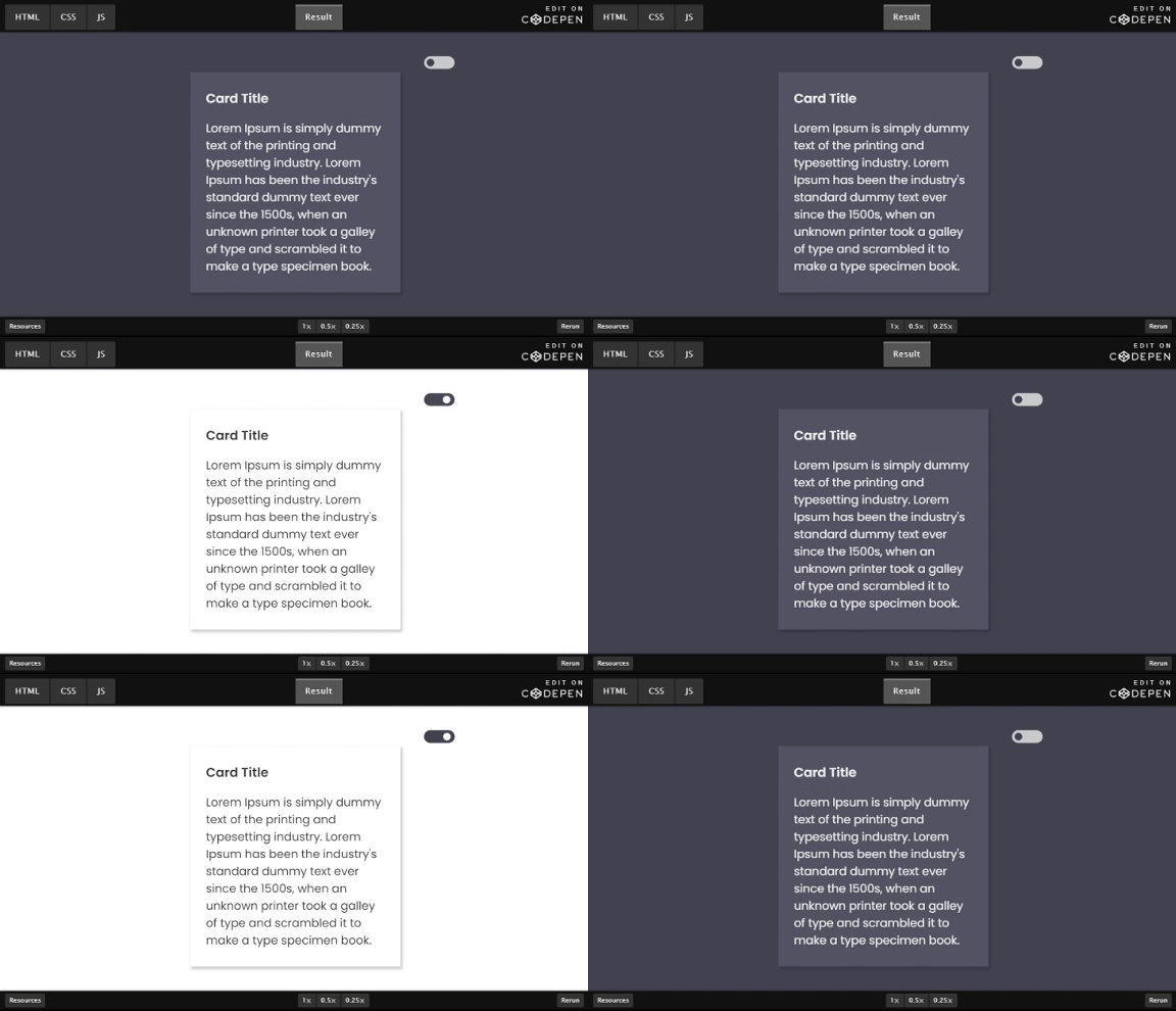
Final result:

You may find the complete code on CodePen at https://codepen.io/chen1223/pen/PobxwMj
That’s it for this tutorial, feel free to leave a comment below orr share your thoughts on dark mode and css variables.
