Introduction
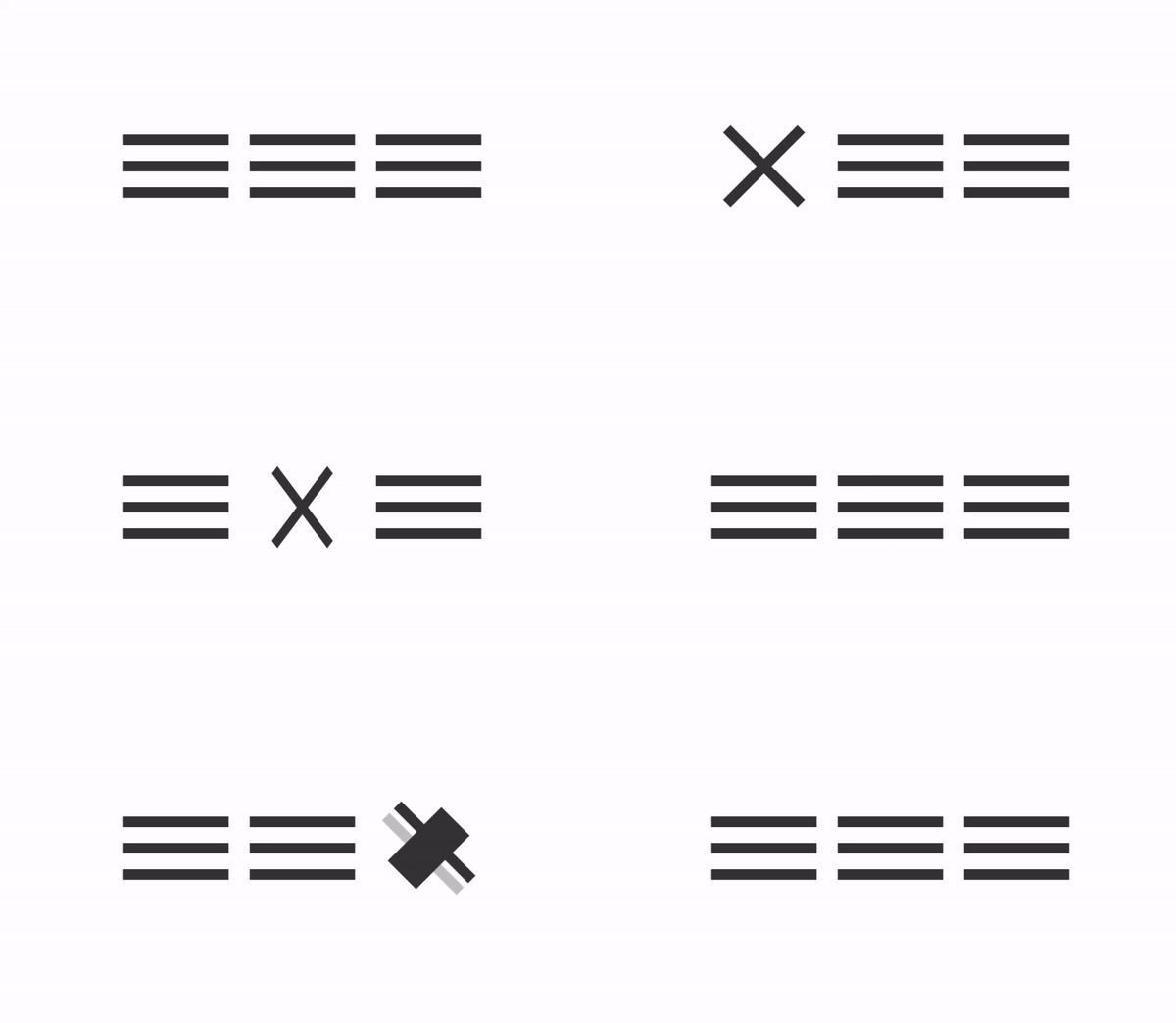
Have you ever come to the situation where you just need a hamburger menu icon for your website, but don’t want to import the entire library? Or have you ever wondered how a hamburger icon is built? Well, if you do then you are at the right place! In this tutorial we will go over how you can build your own hamburger menu from scratch using pure CSS. No additional Javascript or external libraries will be needed. By the end of this tutorial you will at least be able to build three hamburger menus with different animations.

HTML structure
We will use the following HTML structure for all three menus.
<i class="hamburger --one"></i>
<i class="hamburger --two"></i>
<i class="hamburger --three"></i>
Notice that we only need one <i> element for each menu. In fact, you can build most icons with only one HTML element. There are only a few rare cases where you will need the second HTML element. That’s one of the benefits of building your own icon with CSS. Since we only have one HTML element, the file size will be super small, and the performance is way better than using a gif file or using an external library. We choose <i> element instead of a <div> or <span> element because semantically speaking, using <i> element makes more sense. It allows the search engine to understand that the element is nothing more than an icon whereas <div> and <span> elements can have many more purposes.
Setting up the three bars
We start off by establishing a basic width of 200px and height of 120px for the entire <i> element, so that our selector will be able to catch the onHover event even when a user hovers at the white spaces between the three bars.
.hamburger {
  width: 200px;
  height: 120px;
  position: relative;
  margin: 0 20px;
}
For the before and after elements, we give them width and height equal to its parent (the <i> element) and specify the background-color property to currentColor and finally set color to #333.
Note. We set background-color to currentColor instead of specifying the color we want directly, so that if later on we wish to change color on both elements, we can simply update the color property, and it will affect both elements at the same time.
.hamburger {
  &::before,
  &::after {
    content: '';
    position: absolute;
    width: 100%;
    height: 20px;
    color: #333;
    background-color: currentColor;
    transition: all .45s ease-in-out;
    &::before {
      top: 0;
      transform: rotate(0);
    }
    &::after {
      bottom: 0;
      box-shadow: 0 -50px currentColor;
    }
  }
Animate the first hamburger menu
For the first hamburger menu, we will perform the following actions on hover:
- Move the first bar (the before element) to center and rotate it by 45 degrees clockwise
- Hide the second bar (the box-shadow of the after element) by setting its color to transparent and move the third bar (the after element) to the center. Then rotate the third bar by 45 degrees counter-clockwise.
.hamburger.--one:hover {
  &::before {
    top: 50px;
    transform: rotate(45deg);
  }
  &::after {
    box-shadow: 0 0 transparent;
    bottom: 50px;
    transform: rotate(-45deg);
  }
}
Animate the second hamburger menu
For the second hamburger menu, we would like to add a little change. At the end of animation for the before and after element, we’d like to rotate the entire <i> element on the Y-axis by 180 degrees counterclockwise.
- Move the first bar (the before element) to center and rotate it by 45 degrees clockwise
- Hide the second bar (the box-shadow of the after element) by setting its color to transparent and move the third bar (the after element) to the center. Then rotate the third bar by 45 degrees counter-clockwise.
- Rotate the entire <i> element on the Y-axis by 180 degrees counterclockwise.
.hamburger.--two {
  transform: rotateY(0);
  transition: all .45s .15s ease-in-out;
  &:before, &:after {
    transition: all .2s ease-in-out;
  }
  &:hover {
    transform: rotateY(180deg);
    &::before {
      top: 50px;
      transform: rotate(45deg);
    }
    &::after {
      box-shadow: 0 0 transparent;
      bottom: 50px;
      transform: rotate(-45deg);
    }
  }
}
Animate the third hamburger menu
Let’s try a completely different approach for the third hamburger menu. We will set the initial position for the before element at the middle as the second bar. Set the initial position of the after element at the top as the first bar, and finally make the box-shadow property be the third bar at the bottom.
On user hovers the third hamburger menu, we will perform the following actions:
- Reverse second bar’s (the before element) width and height by shrinking the width to its original height and growing the height to its original width.
- Move the first bar (the after element) to the center and hide the third bar (the box-shadow property of the after element).
- Rotate the entire <i> element by 45 degrees clockwise.
.hamburger.--three {
  transition: transform .55s .3s ease-in-out;
  &:before,
  &:after {
    transition: all .3s ease-in-out;
  }
  &:before {
    width: unset;
    height: unset;
    left: 0;
    right: 0;
    top: 50px;
    bottom: 50px;
  }
  &:after {
    top: 0;
    bottom: unset;
    box-shadow: 0 100px currentColor;
  }
  &:hover {
    transform: rotate(45deg);
    &:before {
      left: calc(50% - 10px);
      right: calc(50% - 10px);
      top: -40px;
      bottom: -40px;
    }
    &:after {
      top: 50px;
      box-shadow: 0 0px transparent;
    }
  }
}
Conclusion
There you have it! Three different approaches and animations for the commonly used hamburger menu. Feel free to try out your own animation by adjusting how the before/after element will change on hover.
The complete Codepen project can be found here:
