
Introduction
In the last tutorial UI Animation in Adobe XD we explained the concept behind animations and went over the necessary steps to create them in Adobe XD. In this tutorial, we will take a step further and implement the design into real working code that can be used in your next project to create interactive user experiences.

Background knowledge before we start
Recall animations consist of a starting state and an ending state, in CSS world the idea is identical. Similar to changing properties in Adobe XD, in CSS we define different CSS properties in each state and then link them together by attaching the ending state to DOM events like onClick or onHover. In CSS there are actually two ways to make animations:
1. Change a specific CSS property directly and attach transition
2. Define an animation function and attach it to the element we want to manipulate
For most scenarios, the first approach would be sufficient, but for complicated animations that change multiple properties or animations can be reused, it’s better to define an animation function and reuse it where possible.
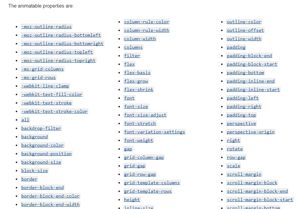
Animatable CSS Properties
In CSS, there are properties that are animatable and others that aren’t. If you use a property that is not animatable, the end result will look like a glitch because it will not respond to the transition you set, but directly jump from the starting state to the ending state.
You can find the complete list of all animatable CSS properties from the Mozilla website at https://developer.mozilla.org/en-US/docs/Web/CSS/CSS_animated_properties. The list may be long, but if you remember the rule of thumb then it shouldn’t be hard to understand:
Only CSS properties that include number are animatable because browsers would need to be able to increase/decrease the number gradually in order to create animation effects.
HTML Structure
Unlike Adobe XD, most of the time starting states and ending states would share the same HTML structure, so it’s always a good idea to keep this in mind and plan how the positions of each DOM element would change as other DOM elements appear or hide away during animations.
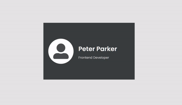
Below are our Starting State and Ending State

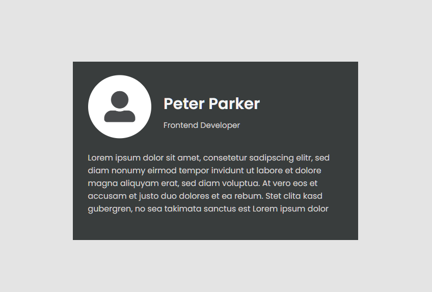
In summary of both states, we have the following four primary HTML elements that we need to animate on:
- Avatar
- Name
- Job title
- Description
During the animation Avatar, Name, and Job title will shrink in size and move up together, so let’s place them in a DIV element called card__header in order to move them together. For the description, it will live alone in another DIV element called card__body. Both DIV elements will reside in a parent DIV element called card, so our top level HTML will look like the following.
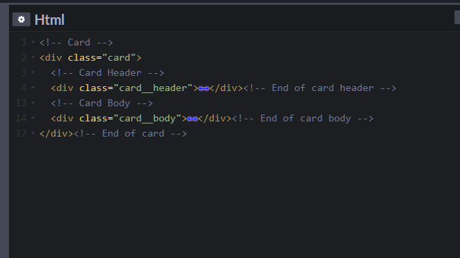
And the complete HTML structure will be:
<!-- Card -->
<div class="card">
  <!-- Card Header -->
  <div class="card__header">
    <figure class="avatar">
      <i class="fas fa-user-alt"></i>
    </figure>
    <div class="user-info">
      <b class="name">Peter Parker</b>
      <span class="job-title">Frontend Developer</span>
    </div>
  </div><!-- End of card header -->
  <!-- Card Body -->
  <div class="card__body">
    <p class="intro">Lorem ipsum dolor sit amet, consetetur sadipscing elitr, sed diam nonumy eirmod tempor invidunt ut labore et dolore magna aliquyam erat, sed diam voluptua. At vero eos et accusam et justo duo dolores et ea rebum. Stet clita kasd gubergren, no sea takimata sanctus est Lorem ipsum dolor</p>
  </div><!-- End of card body -->
</div><!-- End of card -->
Starting State CSS
To get started, let’s first layout the starting state with the following CSS settings:
Since we are developing on Codepen.io, we apply some CSS properties to the body element, so that our card is always centered vertically and horizontally on the page:
body {
  margin: 0;
  width: 100vw;
  height: 100vh;
  display: flex;
  justify-content: center;
  align-items: center;
  background-color: #E4E4E4;
  font-family: 'Poppins', sans-serif;
  font-size: 16px;
}
We then define some CSS variables within the card DIV element.
.card {
  --text-color--primary: #F5F5F5;
  --text-color--secondary: #D8D5D5;
  --avatar-color: #494B4D;
  --avatar-bg-color: #FFFFFF;
  font-size: 16px;
  --gap: 1.875rem;
  --intro-opacity: 0;
  width: 560px;
  height: 350px;
  background-color: #393D3D;
  padding: var(--gap);
  box-sizing: border-box;
  overflow: hidden;
}
For the rest of the elements, we define CSS properties and use variables declared in the card DIV element. This is very helpful as later on when we define animation states, we can simply update the variables and all associated DOM elements will be affected directly.
.name {
  color: var(--text-color--primary);
}
.job-title,
.intro {
  color: var(--text-color--secondary);
}
/*** Card Header ***/
.card__header {
  display: flex;
  align-items: center;
  transform-origin: left;
  transform: scale(0.8);
  height: 40%;
  .avatar {
    margin: 0;
    margin-right: var(--gap);
  }
  .user-info {
    flex: 1;
    margin: auto 0;
  }
}
/*** Avatar ***/
.avatar {
  border-radius: 50%;
  width: 155px;
  height: 155px;
  background-color: var(--avatar-bg-color);
  display: flex;
  .fa-user-alt {
    color: var(--avatar-color);
    font-size: 95px;
    margin: auto;
    transform: scale(1);
    transition: transform .5s .7s;
  }
}
/*** User Info ***/
.user-info {
  display: flex;
  flex-direction: column;
  justify-content: space-between;
  transform-origin: left;
  transform: scale(0.8);
  font-size: 24px;
  .name {
    display: block;
    font-size: 2em;
    line-height: 2em;
  }
  .job-title {
    font-size: 1em;
  }
}
/*** Card Body ***/
.card__body {
  margin-top: 30px;
}
/*** Intro ***/
.intro {
  font-size: 1rem;
  opacity: var(--intro-opacity);
}
Prepare Animations
We will prepare four animations: header-out, header-in, body-out, and body-in.
header-out:
The animation process when the card header shrinks in size and moves to the upper left corner. (zoom out)
@keyframes header-out {
  from {
    height: 100%;
    font-size: 20px;
    --gap: 1.875rem;
    transform: scale(1);
  }
  to {
    height: 40%;
    font-size: 18px;
    --gap: 1.875rem;
    transform: scale(0.8);
  }
}
For the shrinking effect, we use the transform: scale property and shrink the entire card header from 100% to 80%.
For the movement effect, we achieve it by first setting a height in pixel property to the card element then change the height in percentage to the entire card header.
You can see we also change font-size and update the value for the –gap variable, so that when the card header shrinks, the gap will also shrink accordingly.
header-in:
The animation process when the card header grows in size and moves to the center of the card. (zoom in)
@keyframes header-in {
  from {
    --gap: 1.875rem;
    font-size: 16px;
    height: 40%;
    transform: scale(0.8);
  }
  to {
    --gap: 1.875rem;
    font-size: 20px;
    height: 100%;
    transform: scale(1);
  }
}
The header-in animation is just the reverse of the header-out animation.
body-out:
The animation process when the card body disappears and fades out from the bottom of the card. (fade out)
@keyframes body-out {
  from {
    transform: translateY(0);
    --intro-opacity: 1;
  }
  to {
    transform: translateY(100%);
    --intro-opacity: 0;
  }
}
For the disappear effect, we change the –intro-opacity variable from 1 to 0, which will in the end affect the opacity property.
For the slide down effect, we use the transform: translateY property and set overflow: hidden on the parent card DIV element, so when the card body is outside of the parent element, it will be hidden and not overlapping other DOM elements outside of the card.
body-in:
The animation process when the card body appears and slides in from the bottom of the card. (fade in)
@keyframes body-in {
  from {
    transform: translateY(100%);
    --intro-opacity: 0;
  }
  to {
    transform: translateY(0);
    --intro-opacity: 1;
  }
}
Similarly, the body-in animation is just the reverse of the body-out animation.
Attach Animations
Even though in our Adobe XD, we set the animation trigger to onClick, in the world of real browsers, it actually makes more sense to set the animation trigger to onHover.
To attach animations, we add the following new property to the card_header element as the starting state animation:
animation: header-in .5s .7s forwards;Note the forwards option in the end! We need this so that when the animation ends all changed properties will stay at their ending state instead of jumping back to the starting state.
Similarly, we need to add the following starting state animation to che card__body element:
animation: body-out .5s forwards;With that being set, we can start adding the animation trigger and the ending state animation.
.card:hover {
  .card__header {
    animation: header-out .5s forwards;
    .fa-user-alt {
      transform: scale(.8);
      transition: transform .5s;
    }
  }
  .card__body {
    animation: body-in .5s .7s forwards;
  }
}
Be sure to set the transition property, so the animation will be more smooth.
* {
  transition: all .5s ease-in;
}
Final result
The complete code can be found at: